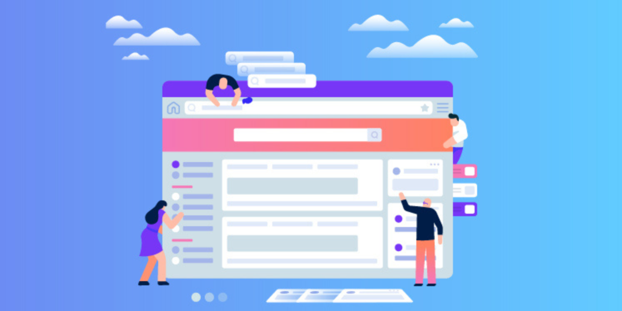
Increase your landing page conversion rates to see quick results – think sales, higher profitability, and stronger campaign results.
So much time, attention, and strategy go into optimizing traffic.
Search marketers spend a lot of time and effort perfecting ad copy or bidding strategies in order to squeeze even more efficiency out of already fine-tuned traffic machines.
However, the landing pages of your ad campaigns have numerous advantages and are simple to implement and optimize.
Spending time improving your landing page conversion rates will result in increased sales, higher profitability, and better digital marketing campaign results.
TIP 1: CREATE DISTINCT LANDING PAGES FOR DISTINCT AUDIENCES
This is not a recommendation to create a separate landing page for each keyword. If you have high-performing, high-traffic keywords, you should consider using designated pages.
This high-impact strategy may increase conversion rates by presenting users with a more accurate smell trail to guarantee they are in the proper location.
First-Time Visitors Vs. Remarketing
If you are sending remarketing traffic to the same landing page as first-time visitors, you should reconsider.
What objections, obstacles, or questions did your visitors encounter on their first visit to your site? How can you deal with them more directly?
Can you provide a special incentive to get the person to take action?
These items can be addressed on your designated landing pages for retargeting audiences.
Sort By Traffic Source
Segmenting your landing pages by traffic source can help you achieve even better results.
This allows you to tailor your page content, call to action, and even policy compliance to each media, such as Google AdWords, Google Display, Facebook, Reddit, and others.
To allow this audience to learn and engage, your Reddit landing page, for example, can have significantly more text than your Facebook landing page.
You can then modify the call to action for the most appropriate stage based on each audience’s funnel stage.
For example, before asking a visitor from a display ad to commit to scheduling a consultation, a free guide may be more appropriate.
TIP 2: TEST MORE INTELLIGENTLY
With enough testing, you’ll discover that the majority of well-thought-out and well-researched hypotheses for improvement are either duds or will actually lower conversion rates.
Furthermore, it is easy to become overly focused on buttons and page colours and lose sight of the items that have the greatest impact.
Here are some suggestions to help you reduce the number of failures and/or poor results from landing page testing.
Priority Should Be Given To Increasing Their Desire To Act
When someone lands on your page, they are almost immediately compelled to take action.
Within the first few seconds of viewing a page, a visitor will determine whether they are in the right place and whether they have found what they are looking for.
While doing a split test, isolate things such as your unique selling proposition, components of trust, and how both are viewed.
Take note of page features visible above the fold, such as headlines, hero pictures, and calls to action.
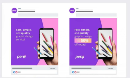
For example, by testing the page subheadline with a trust element rather than focusing on relevancy to the target market, we increased a client’s form submissions by more than 30%.
Changing the button colour would be difficult to achieve this performance.
Layouts, Not Elements, Should Be Tested
Remember that people in North America and similar areas are generally conditioned to enter from the left and exit from the right.
As a standard practise for these audiences, keep introduction elements, such as your logo, on the left and exit elements, such as the phone number, on the right.
With this in mind, it is vital to recognise that the layout of a page may significantly influence how people perceive and engage with the information.
A single change may not result in a significant increase in conversions.
Testing drastically different designs and layouts will yield significantly better results and learnings that will help you improve your performance even further.
We compared a center-aligned form with a single field to a standard form with three fields aligned to the right in one test. For initiating a multi-step form completion, the centre form improved conversion rates by 105%.
You are looking for big wins.
TIP 3: START WITH THE END GOAL IN MIND
If you want to generate more leads, the best next step is to analyze your visitors’ goals and how you can assist them on your page.
Remove All Distractions From The Goal
The first thing to realize is that people on the internet are easily distracted. As a result, landing pages with no navigation typically perform better.
Generally, your landing pages should contain one call to action and no links to other sites.
Make It Simple, Quick, And Convenient
Second, and most crucially for mobile users, after clicking on an ad, most users skim rather than read the content of a website.
Online visitors, on average, do not scroll down; if they do, they do not scroll far.
When someone scrolls down the page, it is best to follow them with a sticky bar so that the call to action remains with them. This saves them from having to scroll even further when they’re ready to act.
For communicating benefits and establishing trust, use bullets and images rather than descriptions and content. Make sure these items are above the fold and require little scrolling.
TIP 4: LESS IS MORE
Writing concisely takes much more time and effort. However, the increased conversion rates are worthwhile.
Write In A Clear And Concise Manner
Concise landing pages communicate important information in a concise manner. This is greatly aided by well-designed icons, images, and headlines.
The more easily understood your content is, the higher your conversion rates will be. For most industries, the readability of your landing page text should be between third and fifth grade.
Use readability tools to make your content easier to read and understand.
Did you know Ernest Hemingway’s writing grade is a 5? As a result, your goal is to write intelligently and clearly at the same time.
The User Experience Takes Precedence Over Design
After designing our best and most beautiful landing page to date, we learned a valuable lesson.
It was exceptional, and everyone was impressed with the design’s outcome. We launched it, and lead conversions quickly dropped to zero.
This is an extreme case, and after ruling out all other possibilities, we returned to the original website. Conversion rates increased.
Page speed and usability will always outperform a visually appealing design in terms of conversions. It makes no difference how impressive you appear.
Users will not convert if their needs are not met immediately or if the page cannot be loaded quickly.
The same can be said for legibility. The best contrast for readability is black text on a white background.
Allow For Impairments
It is also true that some internet users have vision or other impairments that necessitate the use of screen readers and other technology.
There are accessibility and compliance checkers for your website that will scan and score your landing pages. These tools detect problems for screen readers and other assistive technologies, ensuring that your content is accessible and usable for everyone.
The landing page employs colour filters to guarantee that folks who are colorblind can see and interpret the page components.
You can also add accessibility apps to your pages to help with WCAG (Web Content Accessibility Guidelines) and ADA (Americans With Disabilities Act) compliance.
TIP 5: NOTHING BEATS A GOOD DEAL, ESPECIALLY IF IT’S CREDIBLE
The most effective way to win in the marketplace is to advertise a better deal. So long as the offer is credible.
A Fantastic Deal Includes The Following:
- Scarcity and a sense of urgency
- Immediate benefit or bonus
- Believability and uniqueness
The best and simplest way to improve your landing page conversion rates is to provide a great offer.
Scarcity And A Sense Of Urgency
A great offer motivates visitors to act and gives them a reason to convert now rather than later.
Making someone’s availability limited is an effective way to get them to act. This is also referred to as FOMO (fear of missing out).
Consider how you can incorporate FOMO and a sense of urgency into your offer on your landing page by using legitimate scarcity, such as limited availability and countdown timers.
Scarcity and urgency can be effective tools for increasing conversion rates. However, they must be used responsibly and ethically.
